Will Neuromorphic Design Stand the Test of Time?
Oct 21, 2024Neuromorphic design is an emerging web and app development trend that brings an innovative and tactile aesthetic to digital interfaces. Its inspiration stems from skeuomorphism, which aimed to mimic real-world objects in digital designs but with a more modern twist. Neuromorphic combines flat design with subtle, life-like 3D effects, creating interfaces that feel like both part of the screen and tangible to the touch. In this blog post, we’ll explore what neuromorphic design is, its benefits, and how it is used to create immersive digital experiences.
What is Neuromorphic Design?
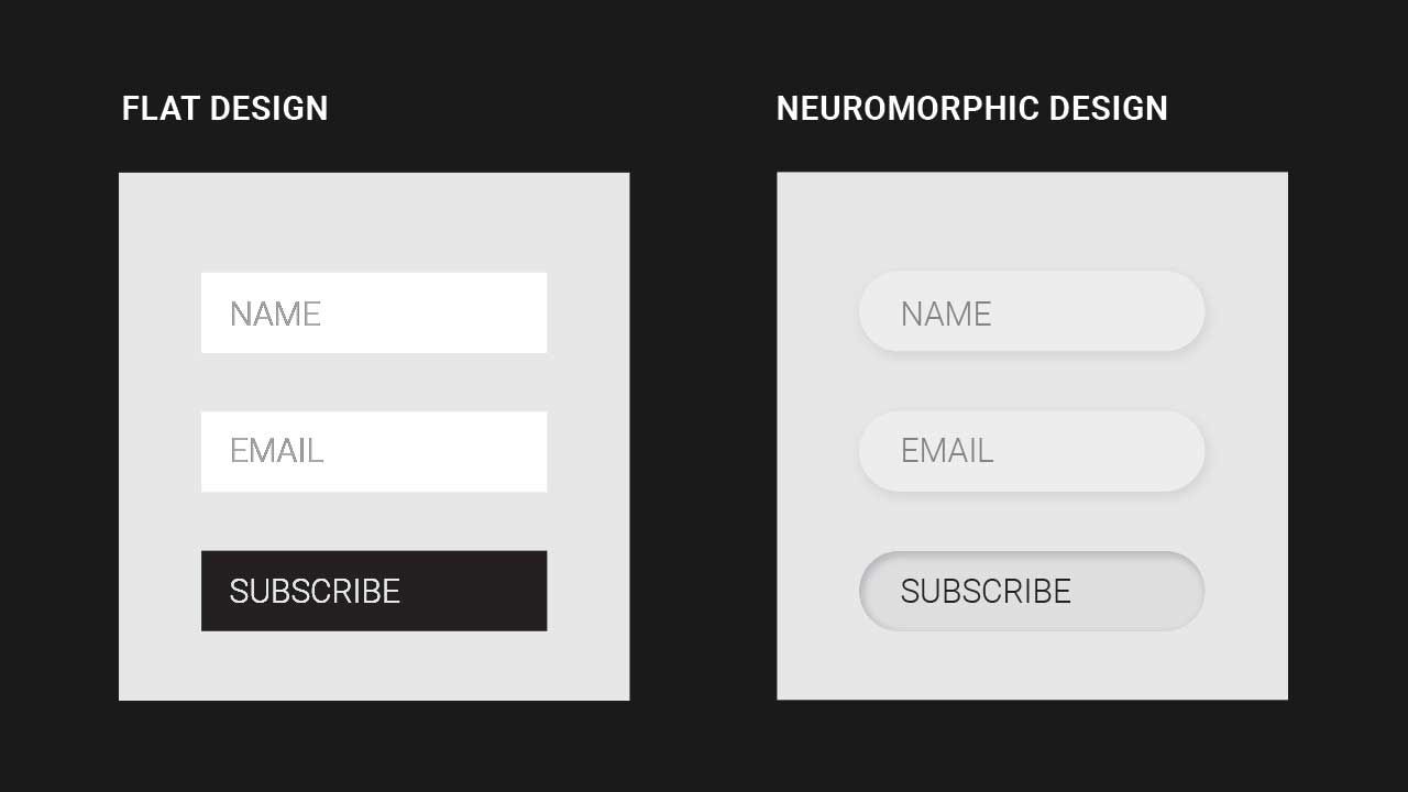
Neuromorphic design bridges the gap between flat and skeuomorphic design. It focuses on giving interface elements depth, using soft shadows and gradients to create the illusion of embossing or debossing on the screen. These elements often appear extruded from or recessed into the background, creating a more tactile and realistic look.
The design typically utilizes monochromatic colour palettes, with subtle variations in light and shadow to create the illusion of depth. The result is a soft, minimalist aesthetic that’s easy on the eyes while providing a distinct sense of hierarchy and interaction.
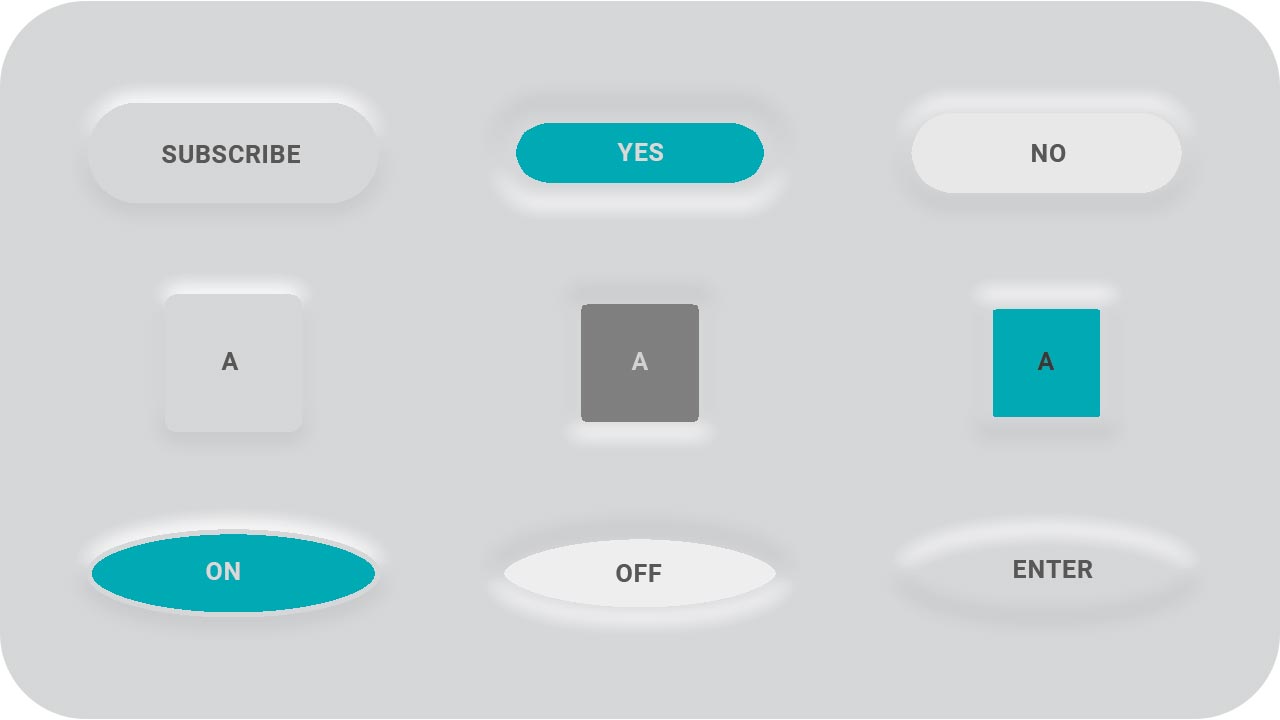
Neumorphism emphasizes subtle contrasts and minimalistic UI elements, focusing on creating soft, 3D-like effects. However, while aesthetics play a significant role in design, seasoned designers understand that usability should always come first. This is especially critical when it comes to neumorphic buttons, where the low contrast and soft edges can compromise functionality, making them difficult for users to identify or interact with effectively. Balancing form and function is key, and in the case of neumorphism, prioritizing usability is essential to ensure a positive user experience.

Why is Neuromorphic Design Important?
- Tactile Experience: One critical benefit of neuromorphic design is the tactile experience it creates. Buttons, sliders, and other interactive elements appear as if they can be physically pressed or moved, enhancing the overall user experience. Users instinctively understand which elements are interactive because they mimic real-world objects.
- Minimalist and Clean Aesthetic: Neuromorphism often uses a minimal color palette, using subtle differences in light to give structure to the design. This approach ensures that the interface doesn’t feel cluttered while still maintaining an interesting, interactive appearance. The clean, futuristic look is becoming especially popular in health, wellness, and tech industries, where simplicity is crucial.
- Enhanced Usability: The design’s realism improves usability by making interactive elements more intuitive. Users can easily differentiate buttons from the background, while the 3D effect helps them understand that an object is clickable. This design reduces cognitive load, making it easier for users to navigate a website or app.
Challenges of Neuromorphic Design
While neuromorphic design has its benefits, it’s important to note that it comes with challenges. One common criticism is accessibility. The subtle shadows and gradients that define this style can be difficult for users with visual impairments to discern, making it less inclusive if not implemented thoughtfully. Additionally, since the design style relies heavily on shadows, it may not translate well on low-quality screens, limiting its versatility.
To overcome these issues, designers must balance aesthetics and functionality by ensuring that elements are clearly defined and accessible. Implementing colour contrast best practices and using text labels alongside interactive elements can make neuromorphic designs more accessible.
Neuromorphic Design in Action: 3 Sample Websites
1. Spotify
Spotify has embraced subtle neuromorphic design in various components of its website, particularly in its mobile app interfaces. Its play buttons and volume sliders are slightly recessed, creating a 3D effect that enhances user interactivity while keeping the design minimal and modern.
2. Zeta Bank
Zeta Bank, a digital banking platform, incorporates neuromorphic elements into its UI, with buttons and input fields that subtly pop off the screen. These interactive elements improve usability by clarifying which interface parts are clickable while maintaining a sleek, professional appearance that suits the financial sector.
3. Dribbble
Dribbble is a hub for designers to showcase their work, and neuromorphic design is trending on the platform. Designers use soft shadows and gradients to create interactive cards, buttons, and input fields that feel tangible. Explore various examples on Dribbble to see how neuromorphic is used creatively across multiple industries.
Conclusion
Neuromorphic design, with its soft, tactile interface elements, has been gaining popularity in recent years. While it’s undoubtedly trendy due to its sleek, futuristic aesthetics, the question remains: is it just a fad, or will it stand the test of time?
On the one hand, the neuromorphic design presents clear advantages in terms of user engagement. Its 3D-like elements and tactile feel offer an intuitive experience that mimics real-world objects, making interactions more natural. In an age where user experience (UX) is paramount, this approach aligns well with the trend toward more immersive, human-centred design. The popularity of minimalism in tech and product design, seen in devices like smartphones and wearables, further supports neuromorphism’s appeal. Companies in the tech, wellness, and finance industries have already adopted aspects of this style to create clean, engaging, and futuristic interfaces.
However, neuromorphism has its drawbacks, particularly in terms of accessibility. The reliance on subtle shadows and gradients can make distinguishing elements challenging for visually impaired users, a significant issue in an increasingly accessibility-conscious design world. Its heavy dependence on subtlety might also limit its effectiveness on lower-quality displays or in situations requiring clear visual hierarchies.
While neuromorphic offers unique advantages and appeal, it may not become a long-term standard unless adapted for accessibility and broader usability concerns. It’s likely to evolve or blend with other design trends, ensuring that while the core concepts may remain, the pure form of neuromorphic design may not dominate for an extended period. Like many trends in design, its future hinges on how well it can balance aesthetics with functionality.


