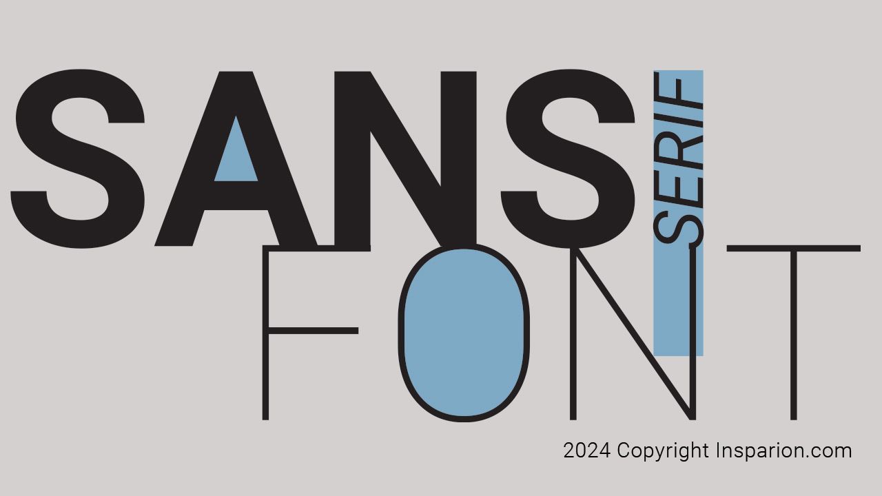
Sans-Serif Fonts: Typographic Simplicity
Aug 06, 2024Sans-serif fonts have become a cornerstone in modern design, valued for their clean lines, simplicity, and versatility. As the name suggests, sans-serif fonts lack the small decorative strokes, or serifs, typically found at the end of letterforms in serif fonts. This absence creates a streamlined, minimalist, functional, and visually appealing aesthetic. Whether in digital media, advertising, or corporate branding, sans-serif fonts are widely used because they convey modernity, clarity, and ease of use. In this article, we’ll explore the history, famous examples, practical uses of sans-serif fonts, and how to choose between serif and sans-serif fonts for different design needs.
Historical Origins
The evolution of sans-serif fonts can be traced back to the early 19th century, during the Industrial Revolution. As technology advanced, so did the need for new, innovative design solutions. Industrial machinery and mass production transformed the world, leading to an era that demanded more streamlined, functional aesthetics in everything from architecture to typography.
The first sans-serif fonts emerged to meet these new demands. One of the earliest and most influential was Akzidenz-Grotesk, created in the late 19th century. Its bold, unembellished letterforms represented a stark departure from the ornate serif fonts that had dominated typography for centuries. Another pivotal typeface, Futura, designed in the 1920s, further cemented sans-serif fonts’ place in the design world. Futura’s geometric shapes and clean lines became synonymous with modernity and forward-thinking design, and it has remained an iconic choice for many designers.
Popular Sans-Serif Fonts
Several sans-serif fonts have become staples in the world of typography, each with its unique characteristics and uses. Some of the most well-known include:
- Helvetica: Perhaps the most famous of all sans-serif fonts, Helvetica is renowned for its clarity, neutrality, and balance. Its timeless design makes it a favourite for everything from logos to signage
- Arial: Widely used in digital media, Arial is a versatile, straightforward font that’s similar to Helvetica but with subtle differences in letter shapes and spacing.
- Verdana: Designed specifically for digital readability, Verdana is often used in web design because its wide letterforms and generous spacing make it highly legible on screens.
- Calibri: A modern sans-serif font, Calibri was introduced as the default typeface in Microsoft Office applications. It is praised for its readability in both digital and print formats.
These fonts are characterized by their simplicity, making them highly adaptable for various design contexts, from body text in web design to large-scale branding efforts.
Choosing Between Serif and Sans-Serif Fonts
Selecting the right typeface is crucial for ensuring the success of any design project. Whether you choose serif or sans-serif fonts can significantly impact how your content is perceived. Below are some key considerations when deciding between the two:
1. Readability
The medium in which you display the content plays a major role in font selection. With their decorative strokes, Serif fonts are traditionally considered more readable in long text passages, particularly in print media such as books and newspapers. The serifs help guide the reader’s eye along each line, enhancing the reading flow.
Sans-serif fonts, on the other hand, are typically easier to read on digital screens. High-resolution displays and varying screen sizes can make smaller, more intricate details of serif fonts harder to discern. Therefore, sans-serif fonts are often favoured for websites, mobile apps, and other digital formats where readability on different devices is essential.
2. Tone and Style
Another critical factor in font selection is the visual tone conveyed by it. Serif fonts are associated with tradition, formality, and sophistication, making them well-suited for formal documents, invitations, and academic publications. Their classic, authoritative appearance lends a sense of gravitas to written content.
Sans-serif fonts, by contrast, communicate a modern, informal, and approachable tone. Their clean lines and simple forms make them ideal for contemporary designs, advertising, and corporate branding. Sans-serif fonts are the go-to choice when you want to project a forward-thinking, innovative image.
3. Versatility
One of the most significant advantages of sans-serif fonts is their versatility. They can quickly adapt to different design contexts, making them suitable for body text and headings. Their minimalist design allows them to work well in various formats, from large print ads to small mobile screens.
In contrast, serif fonts are typically reserved for body text in print media, where their decorative elements can shine without overwhelming the reader. While they are less commonly used for headlines or logos, serif fonts can still work well in specific cases where a more traditional or refined look is desired.
Conclusion
Sans-serif fonts have a rich history and are a staple in modern design. Their clean, simple lines and adaptability make them an excellent choice for various applications, especially in digital media. Understanding the distinctions between serif and sans-serif fonts can help you make informed decisions in your design projects, ensuring that your typography enhances both readability and the overall aesthetic of your work. Whether you opt for the timeless elegance of a serif or the modern simplicity of a sans-serif, the key is to align your font choice with your project's tone, purpose, and medium.


