How to Choose the Right Colour Scheme for Your Website
Oct 16, 2024The colour scheme of your website is one of the most important factors in shaping the user’s first impression. The right combination of colours can communicate your brand’s identity, evoke desired emotions, and guide user behaviour. When selecting colours for your website, understanding colour psychology can help you create a palette that aligns with your brand’s goals and speaks to your audience. In this article, we’ll explore how different colours affect users and provide guidance on choosing a colour scheme that enhances your site’s overall effectiveness.
The Psychology of Color in Web Design
1. Red: Energy, Passion, and Urgency
Red grabs attention and evokes powerful emotions like excitement, passion, and urgency. It’s often used to create a sense of action or movement. E-commerce websites, for example, use red in **call-to-action** buttons to drive conversions, while brands aiming to make a bold, energetic atmosphere might choose red as a primary colour.
However, red can also evoke feelings of warning or danger, so it’s essential to use it strategically to avoid overwhelming your audience.
Example: Coca-Cola effectively uses red to align with its energetic and fun brand personality. Learn more about how red affects consumer behaviour from Psychology of Colors in Marketing.
2. Blue: Trust, Security, and Calm
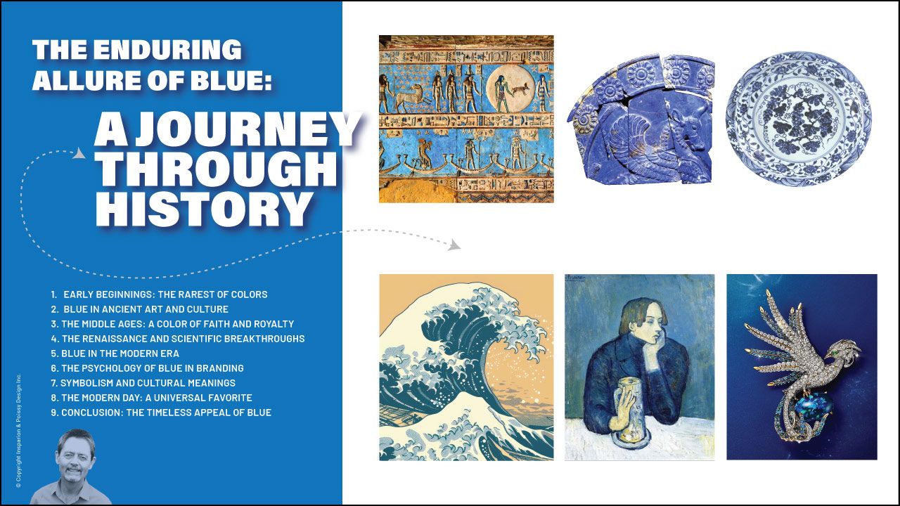
Blue is associated with calmness, trust, and professionalism. It’s the go-to colour for financial institutions, healthcare providers, and tech companies, fostering feelings of security and reliability. Because of its widespread appeal, blue is also a safe choice when targeting a broad demographic.
Example: LinkedIn and Facebook use blue to build trust and professionalism. Discover more about blue’s impact on brand perception at Canva’s Color Guide.
3. Yellow: Positivity, Warmth, and Creativity
Yellow is often associated with happiness, optimism, and creativity. It adds warmth to your site and creates a friendly, inviting atmosphere. However, too much yellow can strain the eyes, so it’s best to use it as an accent colour rather than a dominant one.
Example: McDonald’s uses yellow to evoke warmth and positivity. You can explore more about yellow in design from Smashing Magazine.
4. Green: Growth, Health, and Balance
Green symbolizes nature, growth, and balance, making it a popular choice for health, wellness, and environmental brands. It’s also associated with wealth and prosperity, so financial institutions sometimes incorporate green into their designs.
Example: Whole Foods uses green to emphasize its commitment to health and sustainability. Green’s connection to wellness can be found on Color Psychology.
5. Purple: Luxury, Creativity, and Wisdom
Purple is often used to communicate luxury, creativity, and wisdom. It has historical associations with royalty and exclusivity, making it an excellent choice for high-end brands or those who want to position themselves as creative or innovative.
Example: Cadbury and Hallmark use purple to convey sophistication. Discover how purple adds to the feeling of exclusivity in design on Color Meanings.
6. Black: Elegance, Power, and Modernity
Black exudes elegance, power, and modernity. It is frequently used in minimalist web designs to convey sophistication. However, too much black can make a design feel heavy, so it’s often paired with white or other light tones for balance.
Example: Chanel and Apple use black to reflect their modern, luxurious brand image. Read about black’s use in web design on Envato Tuts+.
7. White: Simplicity, Purity, and Cleanliness
White is associated with cleanliness, simplicity, and minimalism. It helps create a sense of openness and is often used in designs that emphasize space and readability. Due to its clean and professional appearance, white is a common choice for tech and healthcare websites.
Example: Apple uses white to create a sleek, modern look. Learn about using white space effectively at WP Engine.
8. Orange: Energy, Enthusiasm, and Confidence
Orange blends the energy of red and the cheerfulness of yellow. It conveys enthusiasm, friendliness, and confidence, making it an excellent colour for calls-to-action and brands that want to express vitality. However, like red, orange can be overwhelming if overused, so it’s often applied as an accent color.
Example: Fanta uses orange to convey fun and playfulness. Read more about how orange impacts consumer decisions at Color Psychology.
9. Pink: Femininity, Playfulness, and Compassion
Pink is commonly associated with femininity, playfulness, and compassion. It’s often used in brands that target women or younger audiences and can evoke a sense of warmth and nurturing. Lighter pinks are usually soft and inviting, while bolder shades can make a vibrant, confident statement.
Example: Barbie and Cosmopolitan use pink to reflect their playful, youthful brand identity. Discover pink’s role in design from Canva’s Color Guide.
10. Gray: Neutrality, Sophistication, and Balance
Gray is a neutral colour that exudes sophistication, calm, and professionalism. It is often used as a complementary colour to balance more vivid hues. Gray works well in corporate or tech-related designs where a modern, understated look is desired.
Example: Apple and Tesla use gray to highlight modernity and professionalism. Explore gray’s role in design at Color Psychology.
Use a Color Palette Generator
Choosing a harmonious colour palette can be challenging, but tools like colour palette generators make the process easier. These tools can help you create colour schemes that complement each other and fit your brand’s identity. Some popular colour palette generators include:
- Coolors: Offers quick and easy color scheme generation with a user-friendly interface.
- Adobe Color: Adobe’s powerful tool for creating and customizing colour schemes.
- Paletton: A simple but effective tool to create complementary or analogous colour schemes.
By experimenting with these tools, you can fine-tune your palette to match your brand’s personality and appeal to your target audience.
Conclusion
A suitable colour scheme for your website does more than just look good — it impacts how users perceive your brand and their actions. By understanding colour psychology and selecting colours that align with your brand’s values and goals, you can create a cohesive, engaging design that resonates with your audience. Use tools like colour palette generators to simplify the process and ensure that your website’s colour palette works harmoniously together.
Staying mindful of your audience, brand identity, and functionality will lead to a website design that is both visually appealing and effective.
Read more information about What are the primary, secondary and tertiary colours.


